SharePoint 2010: Creating Dashboards and Charts for SharePoint Lists using PerformancePoint and Excel Services from Start to Finish
I really thought making SharePoint Lists into pretty graphs and charts in SharePoint would be far more straightforward than it's turned out to be. Recently, I was given a project where I had to do just that and while I read through about 30 SharePoint BI books, none really gave a straight answer on which of the various SharePoint reporting technologies I should use. It seems I had a choice between:
- Reporting Services
- SharePoint's Reporting Services add-on
- A near-useless SharePoint Chart Web Part
- Excel worksheets
- Excel Web Services
- PerformancePoint Dashboards w/ a SharePoint list data source, SQL Server Analysis Server data source, Excel Workbooks data source, and/or Excel Services as a data source
So overwhelming.
Initially, I decided PerformancePoint Dashboards and PowerPivot would best suit my needs. PowerPivot is an Excel Add-on + a SharePoint Add-on that basically surfaces Analysis Services for reporting and as awesome as it is, the farm I'm using doesn't currently support it (setting up PowerPivot is a bear, I'll admit.) The good news is that it will be, and when it is, it'll be SQL Server 2012's version that comes with Power View and PowerPivot. Whattt!
Ultimately, I decided that I'm going to accomplish my task using Excel Services and PerformancePoint Dashboard Designer. This solution addresses automatic refreshing so your reports will stay (mostly) up to date. For complete beginners, this is basically how it works: You use export a SharePoint list query as a data source in an Excel spreadsheet, use Insert->PivotChart to work with the data, publish those specific charts and tables back to SharePoint using Excel Services, access those published items using PerformancePoint Dashboard Designer (which you can't download from the Internet -- you download the ClickOnce file from your SharePoint page), then publish a dashboard and tada!
(End User) Pre-Configuration
- Obtain access to a SharePoint 2010 server running Excel Services and PerformancePoint Services
- Update: Automatic data refreshing doesn't work with Excel Services when using SharePoint lists as a data source. For that, you'll need a client side script or PowerPivot.
- Enable PerformancePoint Services Site Features and SharePoint Server Enterprise Site features on your site (Site Actions -> Site Settings -> Manage Site Features) if they aren't already.
- Add some items to the Tasks list that comes built-in to Team Sites. In the example below, I have 108 items, but you won't need that much; I'm just working with live data.
- Create a new Business Intelligence Site. Site Actions -> New Site -> Business Intelligence Center
Working in Excel
In the SharePoint Task List you just populated, click List in the ribbon bar, and Export to Excel. You'll be prompted to download a lil .iqy file to your desktop.
Open a new Excel Worksheet
Insert -> PivotTable
When prompted, click Use an External Data Source
Choose Connection -> Browse for more... -> Select the .idq file you just downloaded
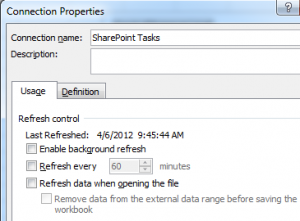
This is important: Even though this connection is to a SharePoint list and you'd think the updates would be instantaneous, you have to explicitly set the connection to refresh in order to keep your chart up-to-date. Let's do this by clicking "Properties" -> Refresh Control -> Enable background refresh, Refresh Every 60 minutes, Refresh data when opening file. Don't click any of those. If you need data refreshes, use PowerPivot or this client-side script.
Click all those boxes, then OK. If you ever need to get to this screen again, you can find it at Data -> Existing Connections -> Right Click -> Edit Connection Properties.
A new toolbox will appear on the right. Drag "Status" to "Row Labels" and the "E" looking thing. This will setup the data to make a chart that counts the number of Completed tasks, New Tasks, Tasks Assigned to Someone Else.. and so on.
- Yay, now click PivotChart (under PivotTools -> Options)
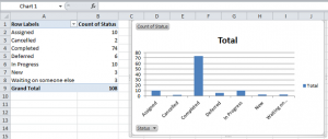
- Choose a chart. I'm just gonna go with the default by clicking OK. Now, your spreadsheet should look something like this, with a PivotTable and PivotChart:
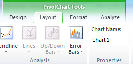
- See how it says "Chart 1" in the upper left hand side? That's the default Chart name. Let' change that by clicking on the PivotChart then clicking PivotChart Tools -> Layout -> PivotChart Name:
I'm going to name mine Task Status Chart
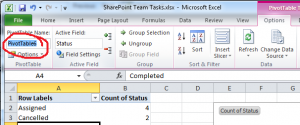
K, now click in the PivotTable area, and under "PivotTable" at the top, click Options. On the left, you'll see where you can change the PivotTable Name. Do that if you want.
Publish Your New Chart (Don't just Save)
Save the Excel file to SharePoint
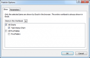
File -> Save and Send -> Save to SharePoint -> Set Publish Options
Publish Options -> Select the individual items by clicking on "Entire Workbook" then selecting All Charts -> OK
- Go ahead and check the PivotTable (notice we didn't change that PivotTable's name so it's still the default PivotTable1) options, too.
- Save your file to SharePoint by browsing for a location or saving it to a library that's already been saved.
Show Published Excel Chart in a PerformancePoint Dashboard
- Browse to the Business Intelligence site you created in the Pre-reqs.
- Hover over Create Dashboards then click Start using PerformancePoint Services.
- You'll then see a page that says "Run Dashboard Designer". Click that.
- Your computer will install about a 16mb ClickOnce application and this is where you'll always come to launch it.
- This interface is a little confusing. All you have to know right now is that you'll be using two item things -- Other Report and Dashboard.
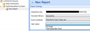
- Let's first get the Report item: Click on PerformancePoint Content on the left hand side to make the "Create" menu available. Then Create -> Other Reports -> Excel Services
- Use the selection tools to navigate down to your spreadsheet, and ultimately, your published items. Below, I'll select Task Status Bar Chart.
- Name your Report in the Properties Tab. You can now click Save or move onto the next step.
- Now we're going to create a dashboard. Click the Dashboard Icon in the upper left hand corner.
- Select your layout. In the example below, I went with two panes, just because.
- When the dashboard appears, you'll see "Details" on the right hand side.
- Expand Reports -> PerformancePoint Content -> Drag the report to any pane.
- While we could just click the Office ball in the upper left hand corner and "Deploy", we need to adjust the size of the chart real quick
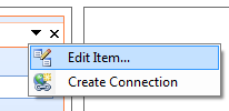
- Click the down arrow on the report within the pane, and select Edit Item -> Size -> Set to Auto-size Width & Auto-size Height.
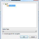
- Now it's time to Deploy your Dashboard! Click the Office ball thing -> Deploy
- Drill down to select your Dashboards library within your BI site.
- The new dashboard will load automatically.
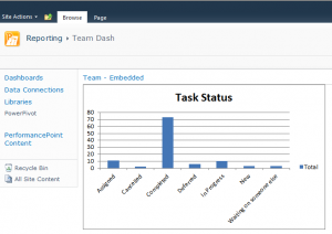
- Congrats, you've done it! Time to bask in the glory of your work.
You may run into administrative errors along the way (I know I did), but that is out of the scope of this blog post. Next up? Accomplishing the awesomer version of this using PowerPivot. Speaking of, Microsoft could really do a better job of marketing PowerPivot as an all-around great reporting tool and not just something amazing for large data sets. This tool is super useful even for smaller data sets. I'll probably be blogging about that sometime soon. More people should know!
